🚨 I’ll be live at 11:30 a.m. ET with Jack Carter🚨
We’ll cover the new options that expire three days a way, which means three times more cash flow opportunities, and more [tap to join us for Market Masters]!
There’s a methodical way I approach predicting where the market will settle during the trading day — and it all comes down to reading gamma exposure charts correctly.
Most traders look at the biggest gamma level and assume that’s where price will pin, but that approach ignores the dynamics that truly drive intraday movement.
My process starts with how calls and puts are arranged. On my charts, yellow represents calls and purple for puts. I weigh them against each other to see where the imbalance lies and ask the question that matters most: Where can they hurt the most traders?
When you understand that the market often gravitates toward max pain, you start to see why price behaves the way it does.
I also lean heavily on bullflow.io for this work. Its three-dimensional heat map layout makes it easy to visualize how positioning stacks up and how the pressure shifts across strikes.
Being able to see the contours of call and put exposure — not just flat numbers — gives me clarity that traditional gamma charts simply do not offer.
SPY Positioning Points to a Push Lower
For example, looking at the S&P 500 ETF (SPY) setup on a day recently, the biggest gamma level was only 529 million out to Friday — much smaller than the typical 600-700 million range. Small levels like this instantly grab my attention because they often mean the market has more room to move.
With calls dominating near-term positioning and only modest put support, the setup suggested a downward push would catch the most traders off guard. That pointed me toward the $692-691 region as the likely pin for the session. When calls outweigh puts into the morning, the path of most discomfort is often lower.
The concerning part is not the direction — it’s the weakness of the levels themselves. When gamma’s thin, it does not take much for price to slip outside the expected range, and SPY’s levels were weak enough that even its usual stabilizing zones looked vulnerable.
Why QQQ’s Weak Gamma Levels Raise a Red Flag
The Nasdaq 100 ETF (QQQ) showed an even more troubling setup. The largest level for the day was only 236 million, which is tiny for QQQ. The real size sat farther out on Feb. 20, which means near-term positioning was light and not providing much structure.
With the bubble forming between $624 and $632, but with barely any conviction on either side, price had room to run. Weak levels like these mean the usual magnets that keep price contained simply aren’t strong enough to do their job.
When both SPY and QQQ show thin positioning at the same time, the market’s primed for bigger moves — and not always in a predictable way.
Gamma charts aren’t just about identifying the biggest number. They reveal where traders are exposed, where pain is concentrated, and where price is most likely to drift when market makers adjust their hedging. When levels are weak on both major indexes, caution is not optional — it is necessary.
Jeffry Turnmire
Jeffry Turnmire Trading
I host my Morning Monster livestream at 9:15 a.m. ET each weekday on YouTube, and then 30 Minutes of Awesome at 5 p.m. ET each Tuesday!
Please check out my channel and hit that Subscribe button!
You can also follow along and join the conversation for real-time analysis, trade ideas, market insights and more!
- Telegram:https://t.me/+6TdDE7-F6GlhMmJh
Important Note: No one from the ProsperityPub team or Jeffry Turnmire Trading will ever message you directly on Telegram.
I’m just a regular dude in Knoxville, Tennessee: a husband, father, civil engineer, urban farmer, maker and trader.
I’ve been at this trading thing with real money for 20-plus years, and started paper trading over 35 years ago. I have a knack for making some epic predictions that just may very well come true. Why share them? Because I like helping other people — it’s the Eagle Scout in me.
*This is for informational and educational purposes only. There is inherent risk in trading, so trade at your own risk.
P.S. Why Smart Traders Keep Close Tabs on the CBOE
Stalking the CBOE will always be a net positive.
I keep my eyes peeled for updates, adjustments, and new developments because with each change, there’s opportunity.
For example: Thanks to this simple document…
I’ve been using an options-trading algorithm that’s completely altered how I approach the markets…
This algorithm finds opportunities for 50% gains — or more — in just 60 minutes…
And not just once a day but up to 10 TIMES EVERY SINGLE DAY!
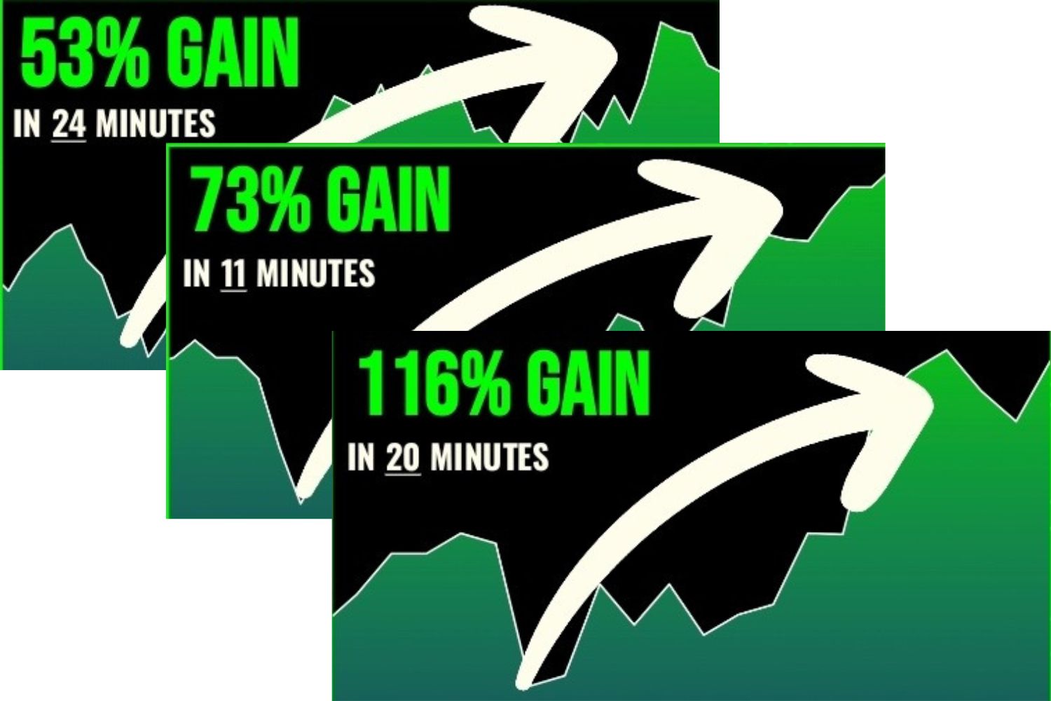
Granted, there were smaller wins and those that did not work out, but this isn’t a one-off occurrence. It’s what I’ve been seeing consistently for months.
The secret? Focusing on just three tickers at a time.
These options are so sensitive to price changes that even tiny moves can lead to significant gains.
And while I can’t promise future returns or against losses, I’ve put together a short rundown of how you can start using them to take advantage of these tiny shifts in the market.
Check This Out Before It’s Gone!
We develop tools and strategies to the best of our ability, but no one can guarantee the future. There is always a risk of loss when trading past performance is not indicative of future results. From 7/10/24 – 1/12/26 the result was a 74% win rate with an average hold time of less than 24 hours on the underlying stock.